
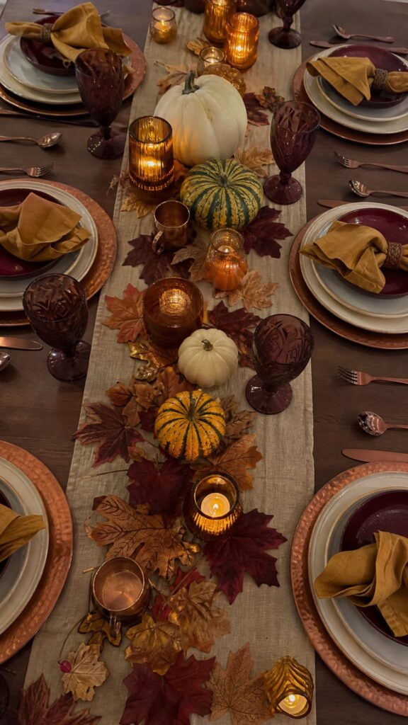
A fall table is not decorated. It is composed. Before you buy a single gourd or taper, decide the palette. Everything else follows from that one decision.
Advertisements1
Think of color as the quiet host of the evening. It sets the mood before anyone lifts a fork. Choose three tones, no more, and let them repeat across linens, glass, and candlelight.
This guide walks you through building that palette, step by step, with tools you likely already own. Less noise, more signal.
Why You'll Love This Recipe
About the Ingredients
1 neutral base cloth (ivory, oat, or warm charcoal)
The base covers 60 percent of the visual field, so keep it quiet. A washed linen runner or full tablecloth both work; a flat cotton sheet in oat works in a pinch.
2 accent tones in fall hues (rust, ochre, plum, or olive)
Pick colors that appear together in nature, like oak leaves and dried grass. If you cannot find two that agree, choose one accent and let the metallic carry the second role.
1 metallic thread (antique brass, copper, or matte gold)
Metallic is your sparkle, used sparingly on flatware, candleholders, or chargers. Brushed finishes read warmer than polished chrome under candlelight.
6 to 8 taper candles in cream or beeswax
Beeswax gives a honeyed glow and a faint scent of honey. Unscented cream paraffin is the safe substitute if anyone at the table is sensitive to fragrance.
1 natural texture element (dried wheat, eucalyptus, or small gourds)
Texture keeps flat color from looking cheap. Dried eucalyptus from a craft store lasts for weeks; fresh rosemary sprigs are a fragrant stand-in.
1 set of glassware with visible tint or weight
Amber or smoke glass echoes fall tones without shouting. Clear heavy glass is the neutral substitute when you want the food to be the color story.
4 to 6 dinner plates in matte ceramic
Matte glaze absorbs light and photographs beautifully. Glossy white is the clean substitute if your menu is colorful and busy.
1 low centerpiece vessel (wood, stone, or matte ceramic)
Keep the arrangement under 12 inches tall so guests can see across the table. A shallow wooden bowl or a stone tray both work well.
Tips & Tricks
Three Tones Maximum
More than three colors splits attention and reads as clutter, so audition your palette before you shop.
Shoot It in Low Light
Photograph your table at dusk with candles lit, since fall colors shift warmer and darker than they look at noon.
Repeat, Do Not Match
Echo the same rust in a napkin and a candle, but vary the material so the table feels layered, not store-bought.
Anchor with One Dark Tone
A deep plum or charcoal element gives the eye a resting place and makes lighter tones glow.
Pro Tips
Step-by-Step Instructions
1. Audit What You Own
Pull every cloth, plate, and candleholder you already have onto the dining table. Seeing them together in daylight tells you which tones repeat naturally and which ones fight.
2. Choose Three Tones
Select one neutral, one fall accent, and one metallic or deep anchor. Write the three names on a card and keep it with you while shopping, so impulse buys stay out of the cart.
3. Test Under Candlelight
Light two candles at 6:00 p.m. and view your swatches from across the room. Colors that look muddy at this distance will look muddy all evening, so swap them now rather than later.
4. Layer the Base
Lay the neutral cloth first, then add a runner or placemats in the accent tone. Run your hand across the surface; if it feels flat, add one textured element like woven rattan.
5. Build the Centerpiece
Arrange dried stems and small gourds in the low vessel, keeping the highest point under 12 inches. Turn the arrangement a quarter turn every few minutes until no side looks bare.
6. Place the Glass and Metal
Set tinted glassware and metallic flatware so the shine lands near the candles. Metal reflects flame, which multiplies the warm glow without adding another color.
7. Finish with Candlelight
Place tapers at least 8 inches apart and away from any low-hanging greenery. Light them 20 minutes before guests arrive so the wax pools evenly and the glow settles.
8. Step Back and Edit
Stand in the doorway and remove one item that does not serve the palette. The table should feel calm from six feet away, not busy.
Delicious Variations
Moody Plum and Brass
Swap rust for deep plum, keep brass, and use charcoal linen for a dramatic evening table.
Harvest Cream and Copper
Stay in oat, cream, and soft copper with dried wheat for a bright, early-October look.
Olive and Smoke
Use olive accents with smoke-gray glass and matte black plates for a modern, minimalist setting.
How to Store Choosing Your Perfect Color Palette For A Fall Dinner Party Tablescape
Refrigerator
Linens and candles do not belong in the refrigerator; store cloth folded in a dry cabinet away from sunlight.
Freezer
Never freeze candles or ceramics, as temperature swings crack wax and glaze.
Reheating
Not applicable. To refresh a table between courses, replace burned tapers and re-fluff the centerpiece greenery.
Frequently Asked Questions
Q: What colors are best for a fall dinner party table?
Rust, ochre, deep plum, olive, and warm neutrals like oat and ivory are the most reliable fall palette. Pair them with one brushed metallic such as brass or copper. Avoid bright primary colors, which fight the warm candlelight.
Q: How many colors should be on a tablescape?
Stick to three tones plus one metallic. That ratio keeps the table cohesive and lets the food stand out. If you want more variety, vary texture instead of adding color.
Q: Should the tablecloth match the plates?
No, contrast is better than matching. A neutral cloth with accent plates creates depth, while matching sets look flat in photos and under low light. Let one element carry the accent color.
Q: How do I make a fall table look expensive on a budget?
Use one quality neutral cloth, real candles, and foraged stems from your yard. Texture and candlelight read as luxury far more than pricey dishware does. Remove anything plastic or overly shiny.
Q: What lighting works best for a fall tablescape?
Warm light between 2200K and 2700K flatters rust, plum, and gold tones. Dim the overheads and rely on candles plus one low lamp. Cool white bulbs will make the whole palette look gray.
Set your table tonight, even if no one is coming. Choose three tones, light one candle, and see how the room changes. When the palette is right, the evening takes care of itself. Less noise, more signal.
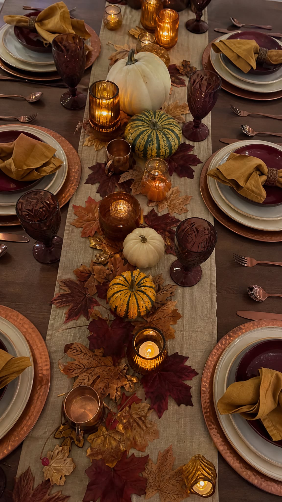
Choosing Your Perfect Color Palette For A Fall Dinner Party Tablescape
Choosing your perfect color palette for a fall dinner party tablescape turns a plain table into a warm, cohesive scene guests remember all season.
🧂 Ingredients
- 1 neutral base cloth (ivory, oat, or warm charcoal)
- 2 accent tones in fall hues (rust, ochre, plum, or olive)
- 1 metallic thread (antique brass, copper, or matte gold)
- 6 to 8 taper candles in cream or beeswax
- 1 natural texture element (dried wheat, eucalyptus, or small gourds)
- 1 set of glassware with visible tint or weight
- 4 to 6 dinner plates in matte ceramic
- 1 low centerpiece vessel (wood, stone, or matte ceramic)
📋 Instructions
- 1Audit What You Own — Pull every cloth, plate, and candleholder you already have onto the dining table. Seeing them together in daylight tells you which tones repeat naturally and which ones fight.
- 2Choose Three Tones — Select one neutral, one fall accent, and one metallic or deep anchor. Write the three names on a card and keep it with you while shopping, so impulse buys stay out of the cart.
- 3Test Under Candlelight — Light two candles at 6:00 p.m. and view your swatches from across the room. Colors that look muddy at this distance will look muddy all evening, so swap them now rather than later.
- 4Layer the Base — Lay the neutral cloth first, then add a runner or placemats in the accent tone. Run your hand across the surface; if it feels flat, add one textured element like woven rattan.
- 5Build the Centerpiece — Arrange dried stems and small gourds in the low vessel, keeping the highest point under 12 inches. Turn the arrangement a quarter turn every few minutes until no side looks bare.
- 6Place the Glass and Metal — Set tinted glassware and metallic flatware so the shine lands near the candles. Metal reflects flame, which multiplies the warm glow without adding another color.
- 7Finish with Candlelight — Place tapers at least 8 inches apart and away from any low-hanging greenery. Light them 20 minutes before guests arrive so the wax pools evenly and the glow settles.
- 8Step Back and Edit — Stand in the doorway and remove one item that does not serve the palette. The table should feel calm from six feet away, not busy.

Kenji explores technology and digital minimalism, helping readers declutter their digital lives and focus on what matters. He writes about app selection, notification management, and creating healthy tech habits, based on his own experiments with unplugging.